Travelling is easy.
A&O HOTELS and HOSTELS
Information
If you lay down in one of a&o’s 25.000 beds, you will rest easy. Knowing, you saved a lot of money without forgoing comfort. Together with BWM Architekten we have aligned design and philosphy of one of the most well-known hotel and hostel chains.
Task
The hotel and hostel chain a&o has been making travelling affordable for some years now. The 35 locations in 21 European cities are attraction poles for mainly young travellers, who enjoy living in the city’s heart. You just feel comfortable here. Why? Because everything’s just so uncomplicated. It’s inexpensive. And you are offered everything you need when you’re on holidays: a soft bed, a delicious breakfast, a little bit of storage space. In short: a haven. And if you like, even more. Relaxed and easy – this is also what the brand is supposed to transport. Naturally at first sight.
Solution
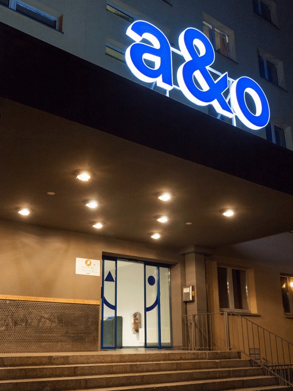
Just plain without decoration, this is how the new lettering of a&o looks. Easy to understand, it doesn’t exclude anyone – according to a&o’s new motto that also functions as new claim: “Everyone can travel”. The typography is as reduced as possible, clearly structured but sends out lots of friendliness. It’s playing a big part in the corporate design. Oh, and the brand has also gotten a face: a smiling one, of course. Because that’s the alpha and omega. Or as we call it: the a&o.
