Restaging of hemp products
CBDNOL
Information
Be it joy, sadness, well-being or pain – how we feel is often not caused by ourselves but can always be brokered with ourselves. Whatever our emotional state, CBDNOL has a versatile, first-class product range and the effects of the hemp plant to the side. Preventive, supportive or treating. Holistic and natural.
Sustainability and highest organic quality, reliability and professionalism are the principles of the Linz-based company, which produces in Austria and does so partly by hand. The high-quality cosmetics, the finest oils, hand-picked pollen and organic hemp-based foods from their own production are not quickly produced lifestyle products. With the power of one of the oldest crop plants in the world, they really help people. A new, down-to-earth and emotional brand identity should now uphold these maxims and convey them with great sensitivity.
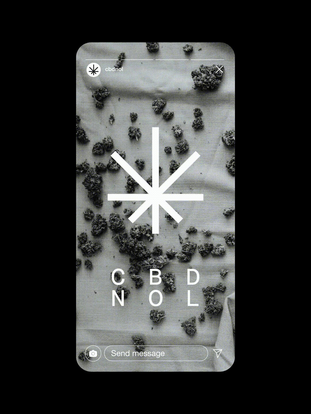
The brand's roots are in nature. One of mankind’s oldest cultivated plants is their business and success model. That is why the hemp leaf remained at the center of the design concept – but now in a progressively abstracted form, as a strong signet with recognition effect and in keeping with a modern zeitgeist.
The CBDNOL logotype was set in two lines to make the core element CBD easier to recognize. An additional logo was also developed for the hand-picked pollen.
The claim “For the way you feel.” conveys a lot of emotion and a lot of respect. It unites the thinking and doing of the brand and the very personal benefits of the products for the customer. Feelings are the motive of the claim, but also the brand's imagery, its visualization. It shows real life, real people and their real emotions.
The packaging design seamlessly continues the stripped-down elegance. Black characterizes a packaging that clearly stands out from the more colourful competition. A bronze finish is used for the premium line. Matching the nature-inspired products of CBDNOL, the paper and cardboard elements of the packaging are made from sustainable hemp paper. Piece by piece a soulful and stringent new brand identity came together. A corporate identity for the eye, for the heart and for you and how you feel.


