Refresh Packaging
Ringana
Information
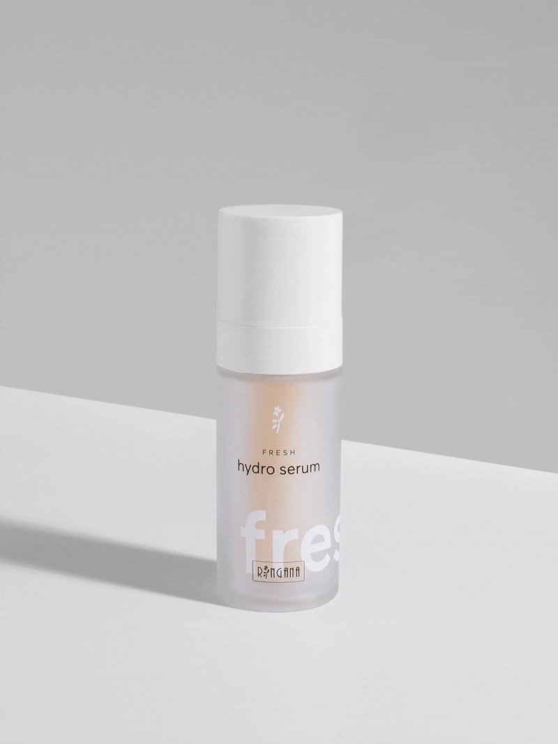
RINGANA Fresh Skincare
Minimalism with maximum impact is a huge part of the RINGANA brand philosophy. The reusable glass flacons clearly follow this commitment, allowing one to see the content of the decorative bottles. A perfected airless technology protects the highly sensitive antioxidant essences by preserving their absolute freshness and effectiveness. Complete transparency, a clean design and reduced labeling underline the purity of the products. The naming is simple and effective, driving the international success of the unique fresh cosmetics brand.
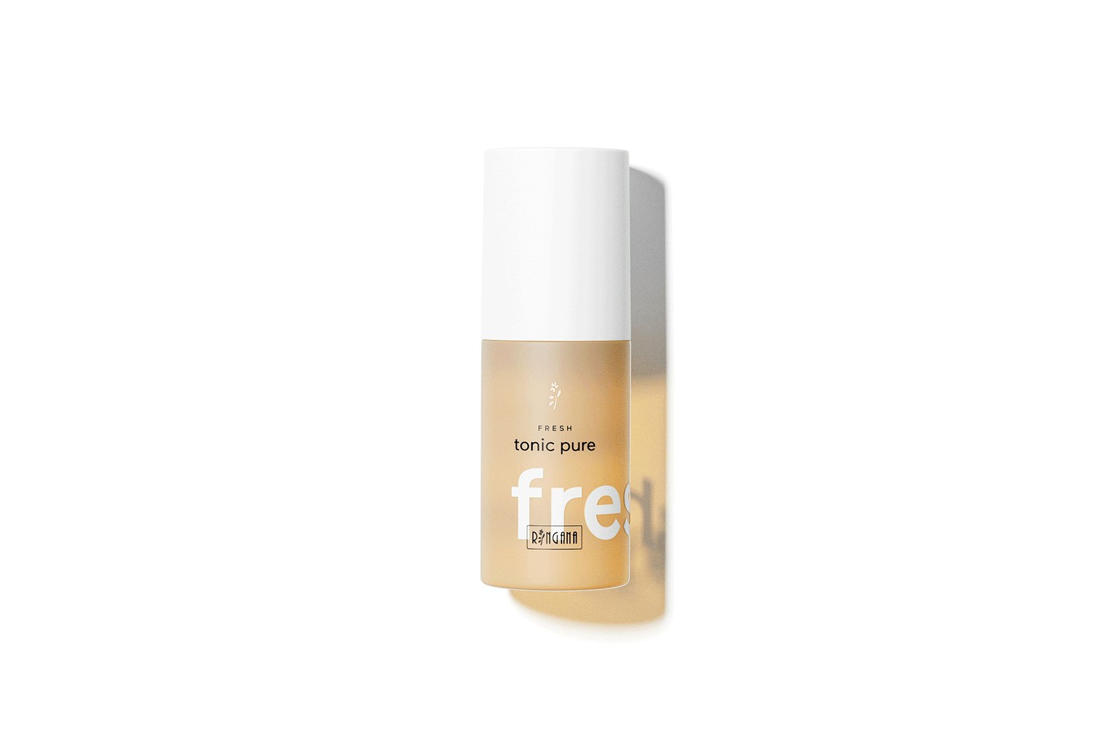
RINGANA Caps
The fresh look of the cap's packaging strengthens the brand identity. A natural color system provides quick orientation. The sustainable packaging in the form of a folding box offers sufficient space for selected product information as well as for an entertaining story about active components.
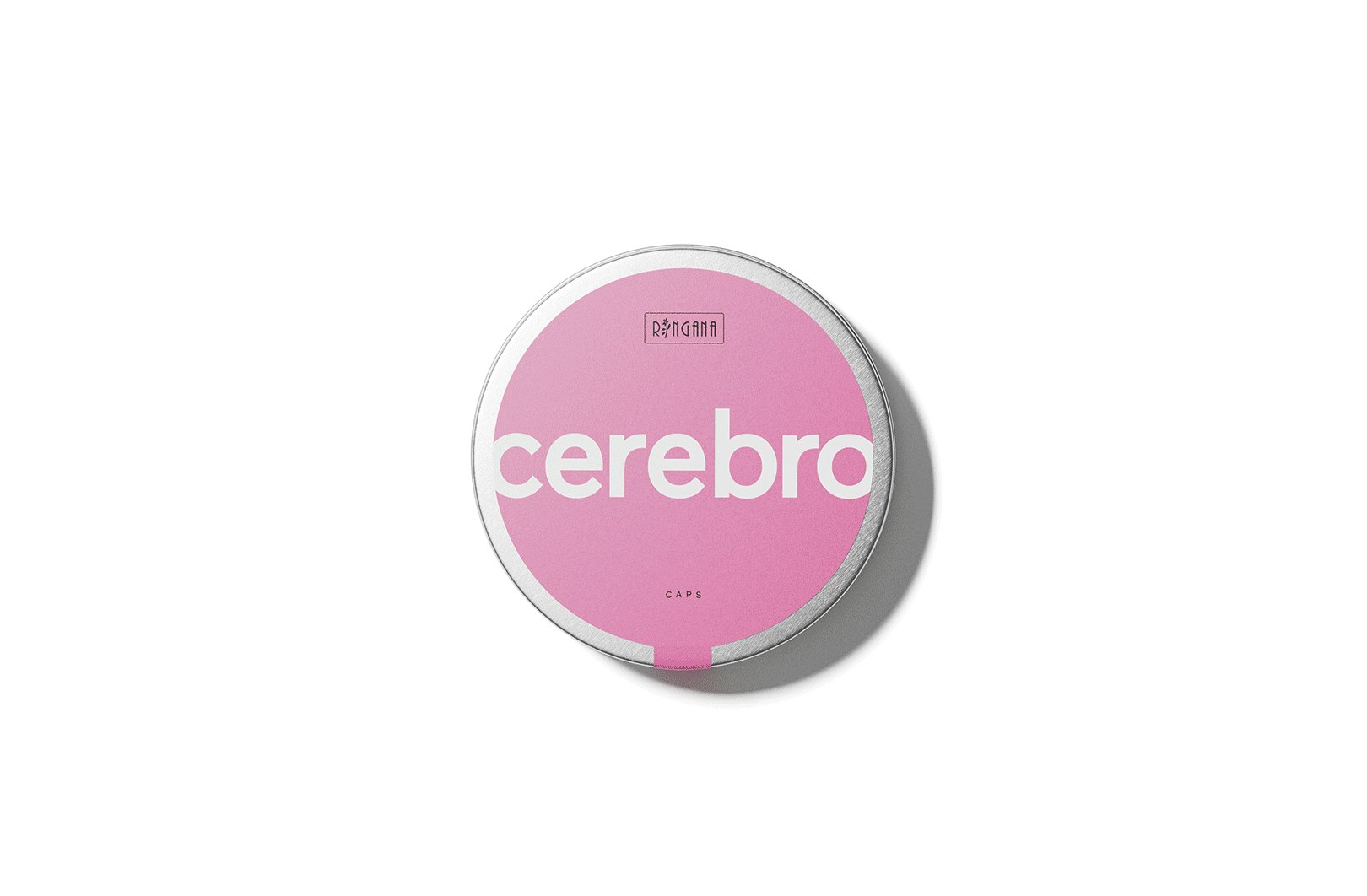
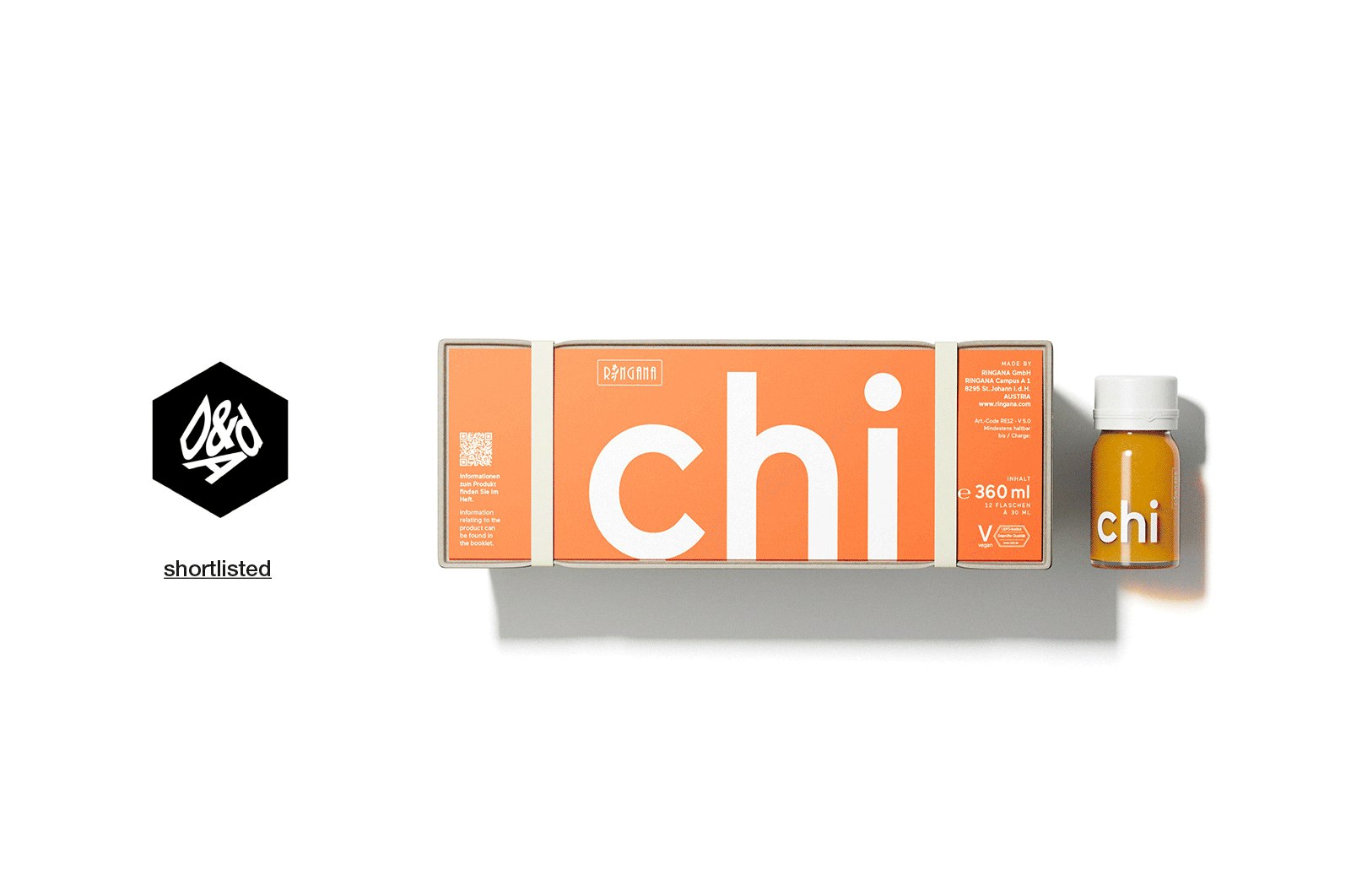
RINGANA Drinks
The award-winning RINGANA packaging design is as natural and innovative as the ingredients themselves. Take the drinks, for example: A fiber-cast cardboard box made from RINGANA waste paper and sealing natural rubber bands protects 12 glass vials. These are covered by the product booklet, which acts as a lid. Functionality, form and sustainability par excellence.
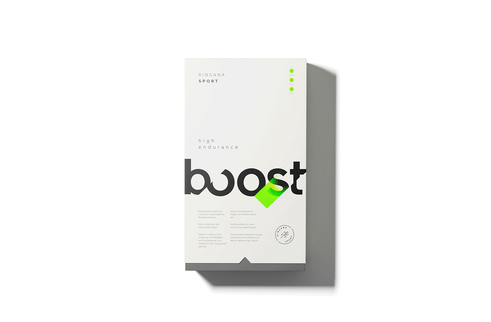
RINGANA Sport Packaging
Boost! Push! Go! The naming and packaging of the RINGANA sports line show where things are headed: beyond one's limits. Although the design is edgier and rougher than the one of supplements, it still reminds of the entire product range. Strong contrasts in combination with bright accents are an incentive to keep up and burn off energy.
