Restaging Organic Wine
Bio Weingut Zahel
Information
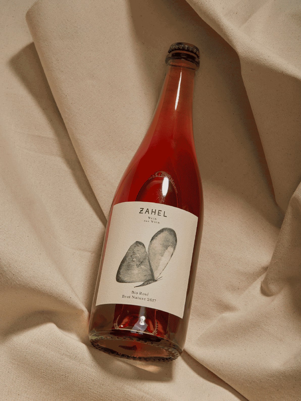
For the Zahel family, making wine means creating something in harmony with nature, tasting the unspoilt state in a glass, seeing the butterfly fly in the vineyard and, as a symbol of the sustainable work, also on the labels.
Task
Wine from the Zahel winery is a harmonious blend of many aspects. A coupling of old and new, the bridging between city and countryside, a composition of good grapes from the best nature. Located in Vienna, the only capital in the world with notable viticulture, the family business is run by Alex Zahel in the fourth generation. As an organic winery, it has always worked with nature and has taken this responsibility very seriously. It allows very special grapes to thrive, unique wines to emerge and the butterflies to fly in the vineyard. As an expression of the work with and in nature, the butterfly always had its place on the labels of Zahel wines. Thus it should also find its way onto the new interpretation of the winery’s brand identity.
Solution
The passion for wine, the diversity of the city of Vienna and the love of craftsmanship are in every bottle of the Zahel winery. The interaction of these elements should be upheld and embodied in the label design, the website and all printed materials. Genuine and pure mood images and photo compositions give authentic impressions of how this very special winery between town and countryside works The handmade logotype is the embodiment of the philosophy and the principles of the family business. The toned down, warm colour scheme is based on the sunrise and sunset over Vienna and lays the ideal groundwork for the development of the core element of the design: the butterflies. They are flying all over the various labels and thus are the connecting tissue across of the wine range. The artwork of the butterflies is created by Hilary Merzbacher-Zahel and is thus – as befits the winery – handcrafted by a family member.
