Packaging for flour that stands out
MPREIS
Information
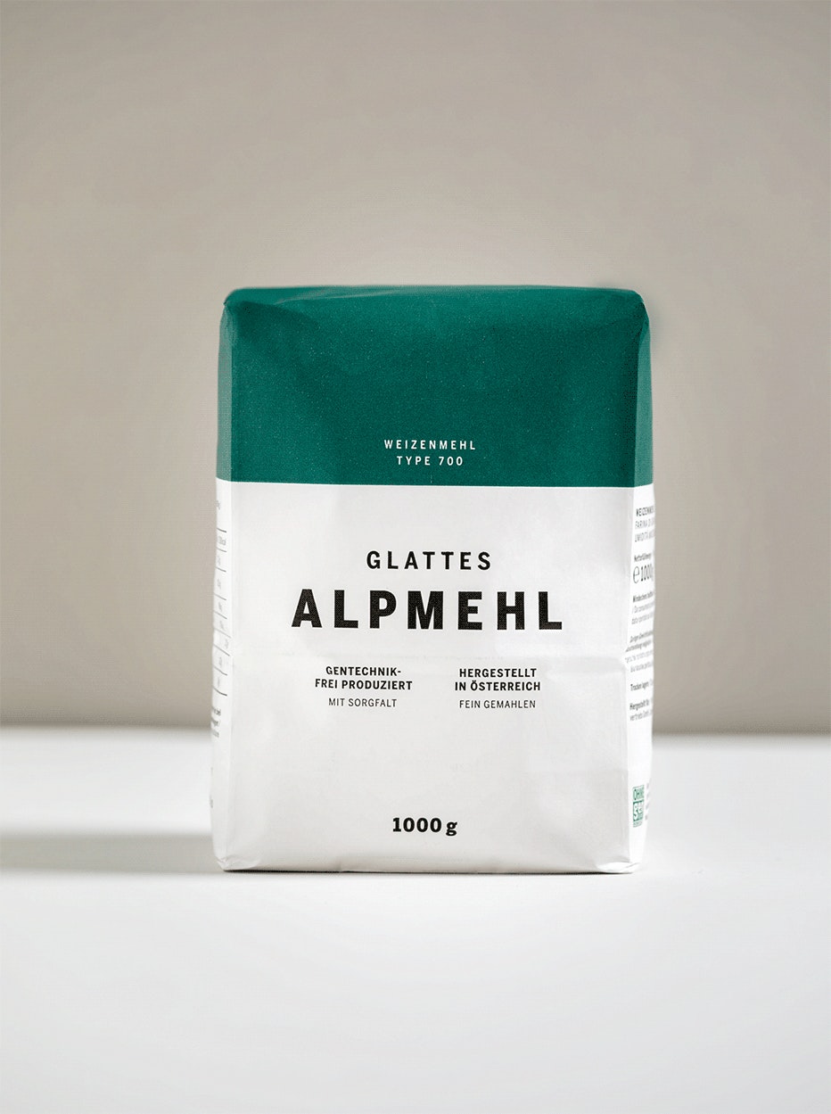
The “Alpmehl”, as you can find it on the shelves of MPREIS, is a thoroughly pure product. But with a timeless product like flour there isn’t anything to add, anyway. Which is also true for the packaging of “Alpmehl”. It is a statement of clarity.
Task
Packaging design has two tasks in food trade. One: It defines the product’s look. Two: It also acts as an indicator for the price. So when there was a new product of MPREIS, which is one of Austria’s largest supermarket chains, there was a packaging like this needed – namely one, that customers will found appealing, high-quality, but still a good value for their money. The product we are talking about? The store brand “Alpmehl”, that becomes a competitor for other suppliers deliberately. Which is why it has to stand out on the product shelf.
Solution
Connect flour. The packaging design makes the Alpmehl’s pure character visible. This is why it is memorably minimalist and without frills. With a design system, that leaves everything out that abstracts – for more merchandise density and lots of recognition value. The modern typography underlines the product’s name and its advantages. Every flour type – all-purpose, coarse, spelt, rye and for cakes – also has its own “colour hat”, that completes the simple white with a five-coloured guidance system. So that customers always grab the right Alpmehl, which then fulfils its destiny: by becoming a delicious cake for example.
